Color psychology reveals how color affects our emotions, behaviors, and decisions, explores the profound impact of color in environmental design, branding and daily life, and learns how to use the power of color to enhance quality of life.
Color is not just a visual enjoyment, it can also profoundly influence our emotions and behaviors. Have you ever felt that time flies especially fast in a fast food restaurant, but that time passes slowly in a cafe? Or when looking at certain colors, there is an illusion of 'forward' or 'retreat'? What is hidden behind these phenomena is actually the mystery of color psychology.
In this article, we will introduce how color affects our perception in different environments, including time perception, distance perception, and the unique role of color in military disguise, love symbols, brand image, etc. You will find that color is not just a tool for decoration, it also shapes our experiences and decisions in a subtle way. Get ready to follow us to uncover the mystery of color psychology and learn how to use the power of color to enhance your quality of life!
Can't date in a fast food restaurant? How color affects time perception
Have you noticed that most of the decorations of fast food restaurants are mainly orange and red, while the tones of cafes are often cold? What are the psychological principles behind this? In fact, this is closely related to the influence of color on time perception.
When we are in an environment dominated by red, we often feel that time passes very slowly. When the sensory time is extended, people are prone to becoming restless; and in the blue environment, time seems to pass by in a flash. This phenomenon has been verified by psychologists. Someone once did an experiment, asking two people to enter a red room and a blue room, asking them to walk out in an hour based on their feelings. As a result, the person in the red room came out after only 40 minutes, while the person in the blue room had not left after 70 minutes.
This also explains why fast food restaurants like to use red and orange: These colors can shorten customers' dining time and increase seat turnover. On the contrary, cafes usually use cool tones to make customers feel relaxed and more suitable for long-term communication. So, the best places to date are of course those places with colder tones, such as cafes or aquariums, where you can enjoy more intimate time.
Can color change distance? Visual illusion of forward color and fading color
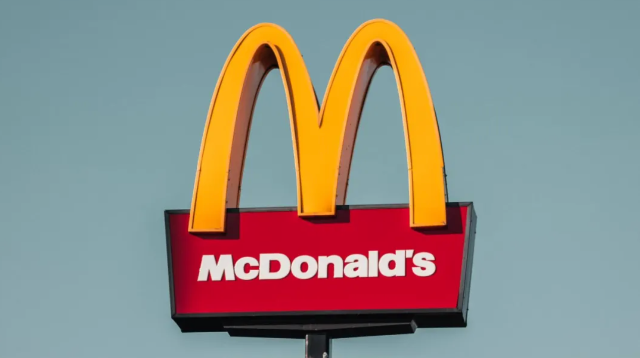
You may also find that when walking on the street, we can easily see the KFC or McDonald's logo even when it is very far away. In addition to the bright colors of these signs, the color itself can also change our perception of distance.
Just imagine, after you stare at a certain color for a while, do you feel that some objects are closer to you and others are further away? This illusion of distance is particularly important in color selection. Usually, advance colors (such as red, orange) will make the object look closer to you, while fading colors (such as blue, purple) will make the object look further away from you.
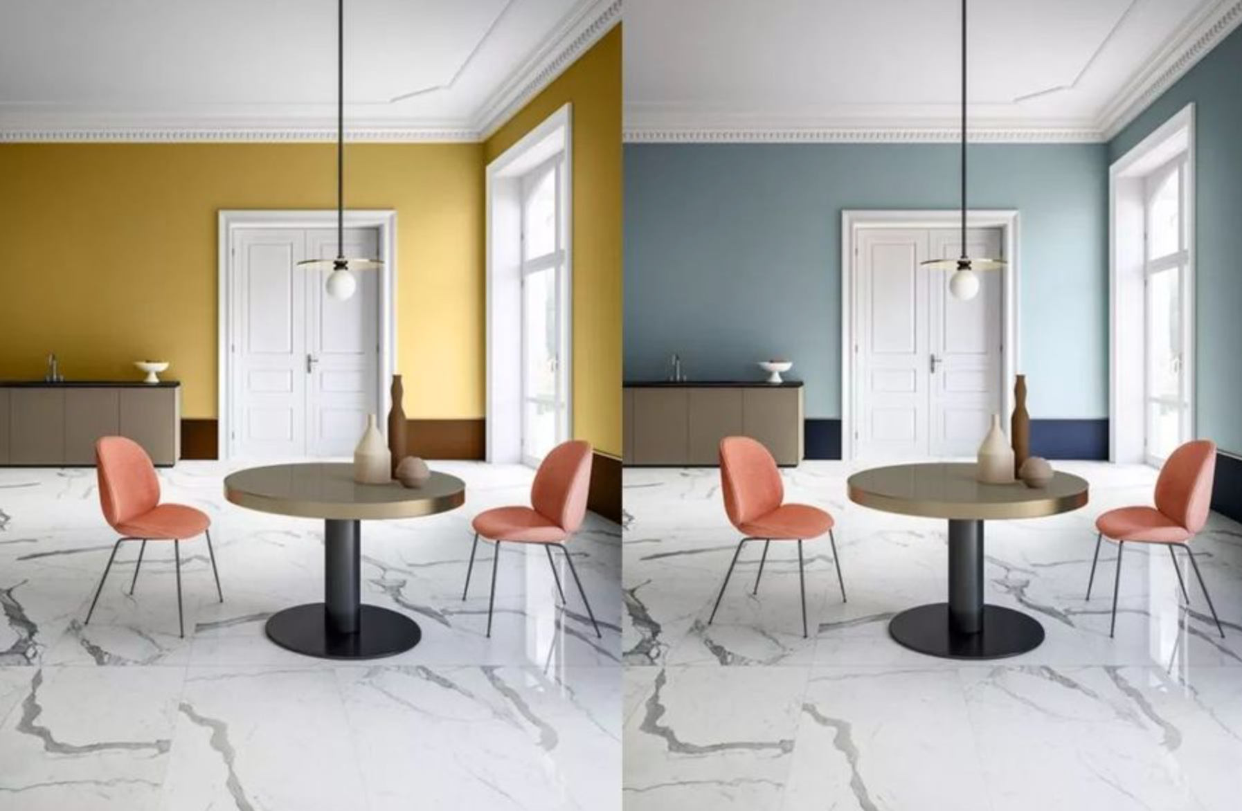
For example, using faded colors as background colors when decorating a room can make the space look more spacious. Similarly, when applying makeup, using foundation that is brighter than the base color on the cheekbones can make the face look more three-dimensional, because this color is a forward color relative to the base color, highlighting the layering of the face.
Is pink the best military camouflage color? 'Mountbatten Fan' in World War II
When it comes to military camouflage colors, you may think of green and brown, which are common colors in nature. However, in the history of war, the British army once used pink as a camouflage color, which sounds incredible, but it is true.
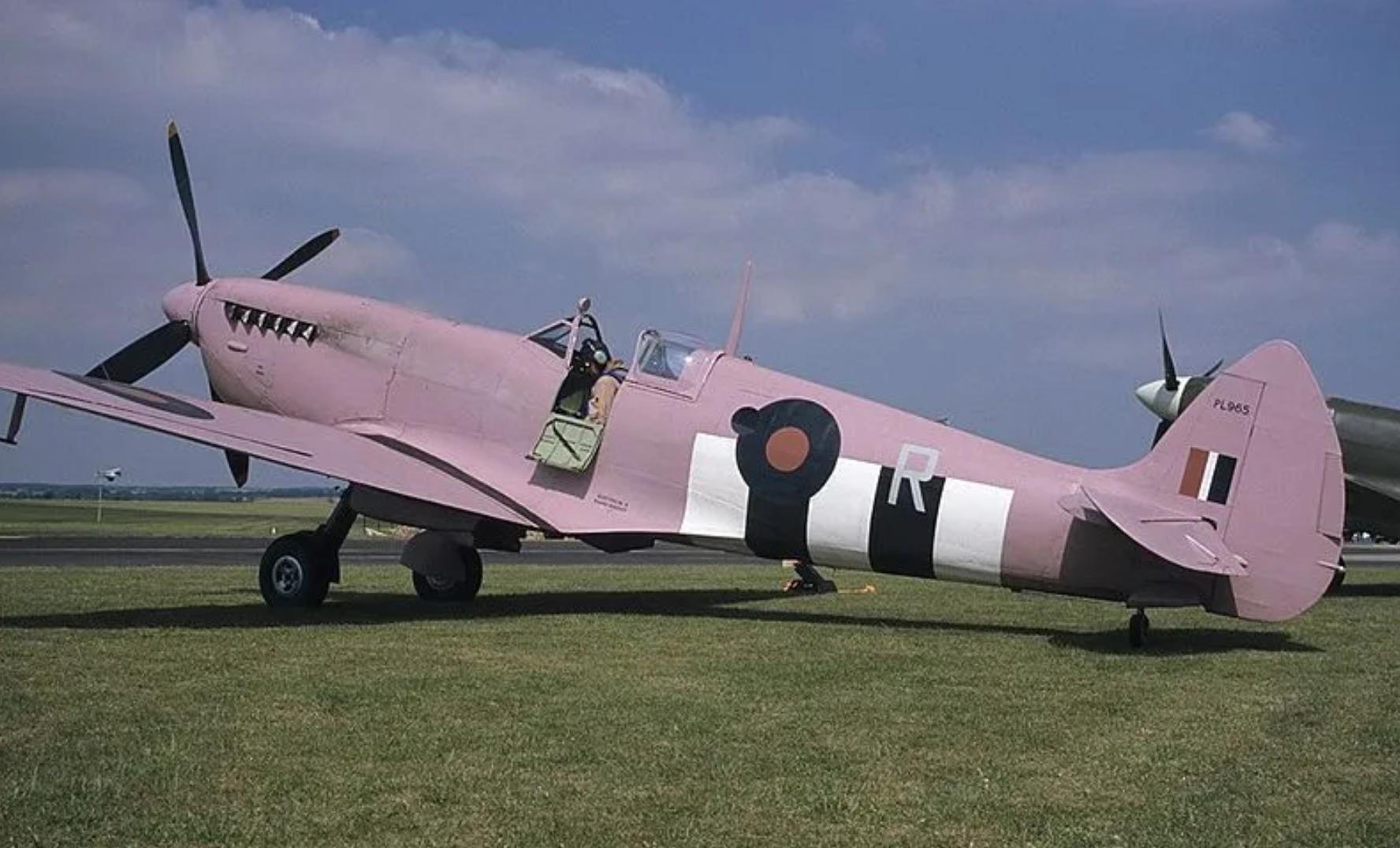
During World War II, British Navy Commander Mountbatten decided to paint his destroyer pink to form a 'Kingam Barbie Group'. This color was later called 'Mountbatten Powder', and under certain light conditions, such as at dusk or dawn, pink can cleverly blend with the sky for invisibility.
However, Mountbatten Powder appears too conspicuous during the day, so it is not used for a long time and is eventually replaced by blue or other camouflage. However, this pink color does add a touch of fun to the cold military world.
Why is yellow always linked to love? The double symbol of yellow in psychology
Yellow is a contradictory color. It can not only symbolize light and vitality, but also express sourness and aging. Van Gogh's paintings often use yellow, and 'Van Gogh Yellow' conveys his passion and desire for life. Yellow is called 'comic color' in psychology because it can make people feel happy and warm.
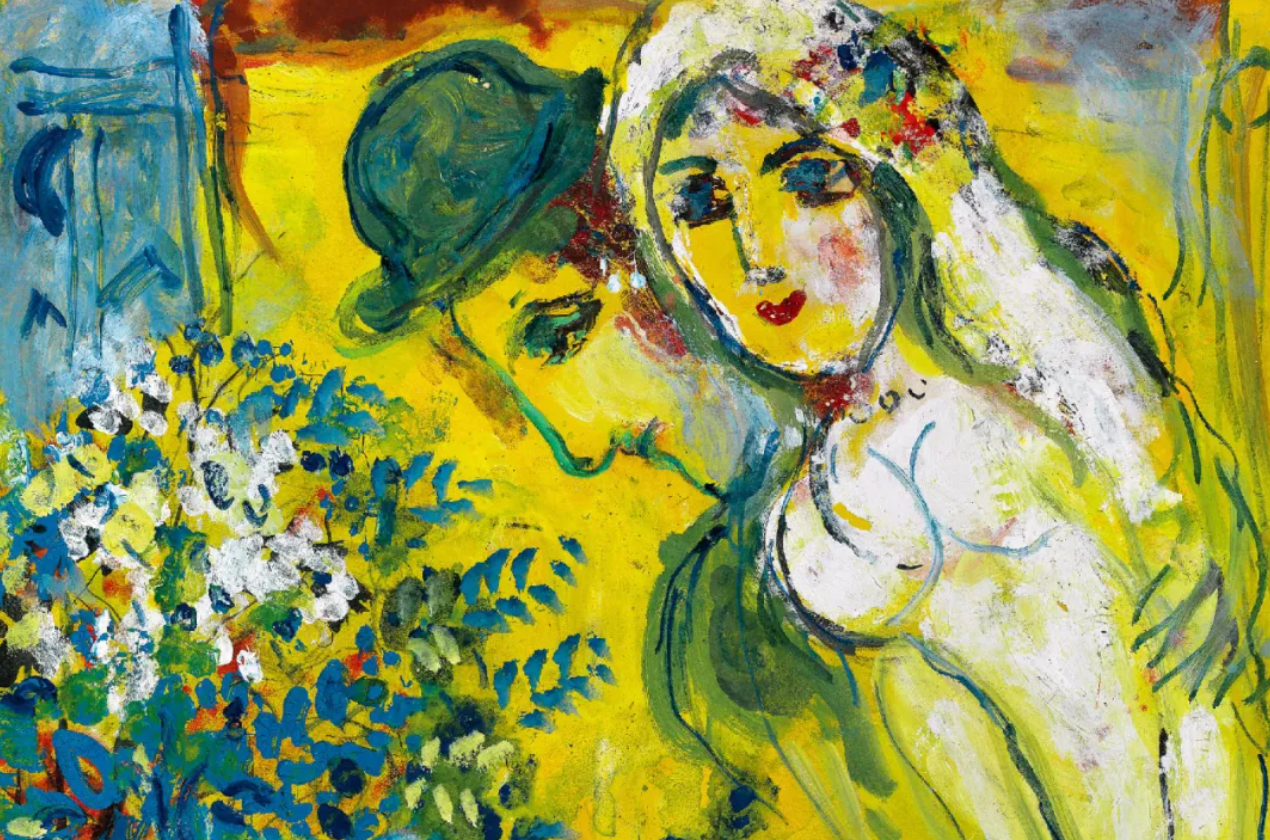
In love themes, yellow often symbolizes sweet and mature feelings. For example, the painter Chagall used yellow to express his strong love for his wife Bella. However, yellow also has its negative meanings, such as it may remind people of the sourness of lemons, or in the Middle Ages, yellow became a symbol of shame and discrimination.
Since ancient times, has red and blue produced CP? Psychological effects of red and blue color matching
Red and blue color schemes are very common in sports competitions because this combination can inspire people's fighting spirit and competitive spirit. Red represents enthusiasm and courage, while blue represents calmness and reason. When these two colors are combined, a strong visual impact will be generated and the recognition will be enhanced.
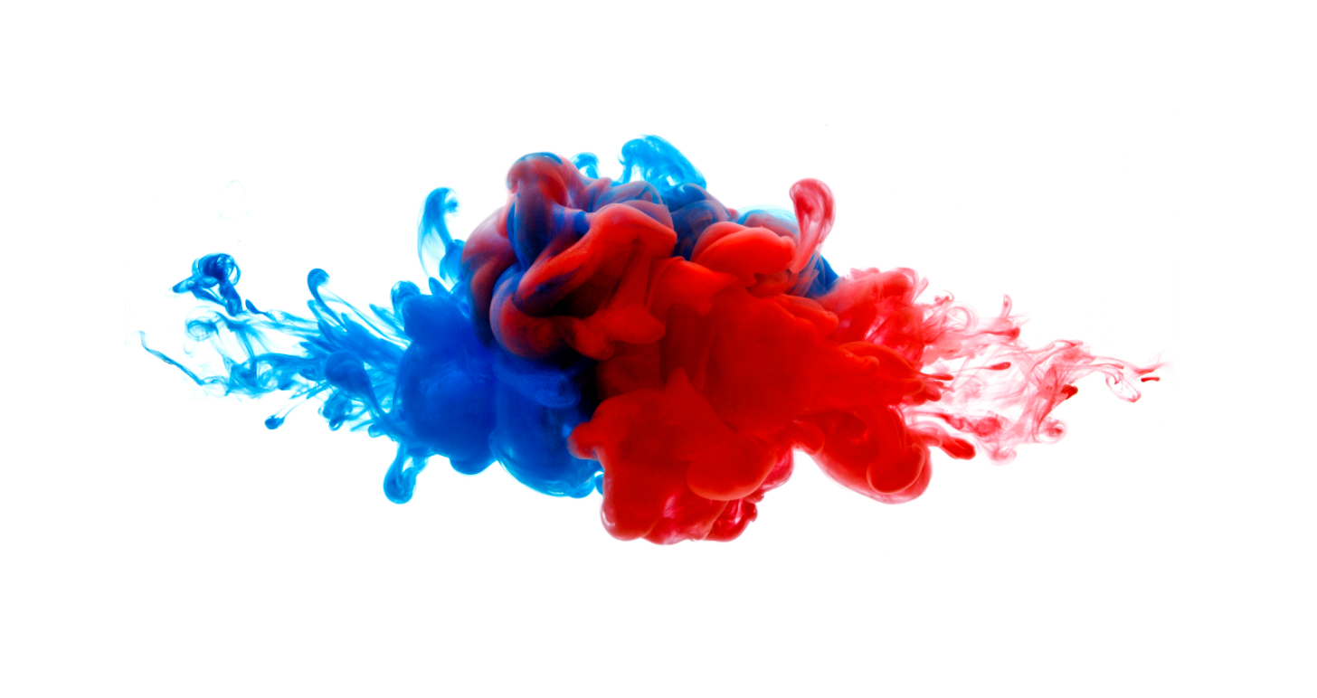
In addition, red, as the longest wavelength color, can visually create a sense of proximity, while blue, as the shortest wavelength color, gives people a feeling of contraction. The red and blue color scheme has therefore become a classic partner in the sports industry and is also widely used in various logo designs.
Is the white wall the culprit for fishing? The impact of color on work efficiency
Although white is bright and clean, it may not be the best choice for improving efficiency in an office environment. Studies have shown that working in a pure white room can easily lead to fatigue and restlessness. A University of Texas study found that people who work in white rooms tend to make more mistakes.
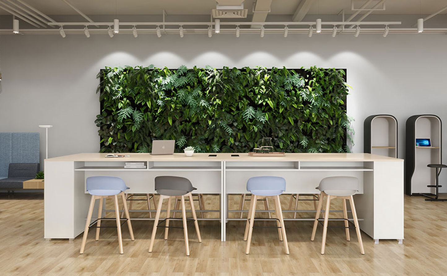
Although white looks simple, it stimulates the brain too strongly, especially against the background of fluorescent lights, white will appear paler, which in turn aggravates the feeling of fatigue. Therefore, if you want to improve your work efficiency, choosing more stable tones such as beige, blue or green may be a better choice.
The top 500 in the world prefer blue logo? The role of blue in corporate branding
Blue is very common among the world's top 500 companies, such as Intel, Facebook, and HP. This is because blue can convey a professional, steady and trustworthy image. In addition, blue can make people feel calm and focused, thus winning the trust of consumers.
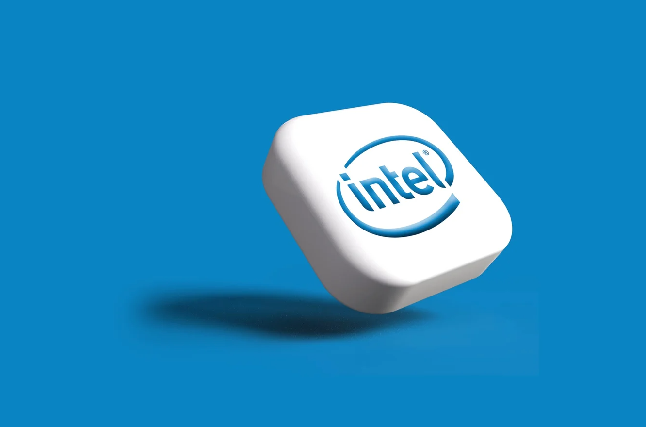
The widespread use of blue logos also reflects its effects in psychology, especially in the high-tech and financial industries, where blue can effectively convey the core value of the brand.
Different areas, the face changes greatly: the effect of color area on visual effects

The area of color has a significant impact on its visual effect. When the color area increases, its original effect will be strengthened, and the larger the area, the stronger the impact force. For example, black looks clean and tidy when it is small, but when it becomes larger, it can make people feel oppressed or terrified. Therefore, in design, the rational use of color areas can help us better convey the expected information.
Conclusion
This is all about today's little knowledge of color psychology. If you are interested in color psychology, you might as well try the FPA (Four-colors Personality Analysis) personality color test. This test is based on Hippocrates's four-liquid theory and divides people's personalities into four categories: red, blue, yellow and green. Through FPA testing, you can quickly grasp your own and others' personality traits and improve your personal interactions in work and life.
Click here to test and obtain detailed analysis results to improve your interpersonal skills and self-understanding.
In addition, you can also learn more about color-related tests through the following links:
- Psychological test: What is the personality color hidden deep in your heart?
- Test what kind of love color you need
- Psychological Test: Test what color your soul is?
- Color psychology test
Through the power of color, you can better understand yourself and others and improve every aspect of your life.
Link to this article: https://m.psyctest.cn/article/jNGeDdMb/
If the original article is reprinted, please indicate the author and the source in the form of this link.